Bernard Hwang

Level Designer

DevBlog

Dev Blog - AquaBlock - Puzzle Signifiers

DevBlog, Solo ProjectBernard HwangComment

This post is a continuation of the last dev blog and covers how signifiers are essential in puzzle games.

Everything you see in this post is work in progress.

What are Puzzle Signifiers?

Here are two terms that I'll be using in this article...

Signifiers: Perceivalbe indicators that communicate appropriate behaviors to the user. When signifers are correctly used, they create "feedforward".

Feedforward: Information that helps answer that question of "what do I want to accomplish".

The presence of both signifers and feedforward always guides the player into desired bevhaior.

Artboard 3-01.png

In a puzzle game, a series of puzzles ideally has a gradual learning curve. Each sequential puzzle ramps up in difficulty and add layers of knowledge. A single puzzle can be designed similarly to follow the same structure. Signifiers can be used to provide direction and validation in the middle of a puzzle to provide stepping stones for the player.

Puzzle Signifiers in AquaBlock

AquaBlock uses signifiers in multiple ways that range in scope.

Corner Pieces

In the first puzzle world of AquaBlock, special colored blocks are used to indicate that they belong in one of the eight corners of the cube. This puzzle constraint creates guidelines for the player in the beginning world to get the player used to how game’s puzzles are solved.

World Block

When the player is selecting which puzzle world to select, they get to see the type of block that world is themed around. The block itself is an indication of what its effect is, and the player can expect to see its use in the puzzles contained in that specific world.

Puzzle Names

There is a name that appears before the start of any puzzle in AquaBlock. The text is meant to stick a certain idea/thought in the player's mind that can serve as a puzzle hint. This signifier proved to be a bit more ambiguous and can have varied effectiveness.

PuzzleName.png

Design

Don’t indicators lessen challenge in puzzle games?

Even with a small scope and a forced control scheme, a mobile puzzle game like AquaBlock has the potential to cause the player to be overloaded with information. This is where things like constraints, mappings, and signifiers come in handy. Signifier do reduce the mental challenge placed on the player, but it also serves as a way of keeping a puzzle attempt-able.

How do hint systems differ from signifiers?

Hints in puzzle games are essentially player-obtainable signifiers. Both are meant to be perceivable indicators of where the action should take place, but hint systems are able to monetize this design concept. One downside of hints systems is that their effect is obvious to the player; players will have their feeling of accomplishment lessened because they realize they relied on a hint. This is why signifers need to be avoid being labeled by the player. 

Dev Blog - AquaBlock - Puzzle Difficulty (and designer rules)

DevBlog, Solo ProjectBernard HwangComment

This post covers how difficulty can be approached in puzzle design and why it is harder to create an easily solvable puzzle than a difficult-to-solve puzzle.

Everything you see in this post is work in progress.

Defining Puzzle Difficulty

Here are factors that I found helped define a puzzle’s difficulty.

  1. Number of Puzzle Pieces
    The quantity of pieces in a puzzle controls the time required in solving a puzzle. Each additional piece increases the number of possible outcomes the player has to consider. The ideal for this factor is try and get the piece count as low as possible while letting the puzzle serve it’s purpose. Every piece costs the player time, so don’t waste it.

  2. Number of Puzzle Mechanics
    The amount of unique puzzle mechanics the player has to consider sets a skill/knowledge gate. This number should be reasonably low to avoid having the player be overloaded with the amount of knowledge they have to recall.

  3. Preceding Information
    As a broader factor, any relevant puzzle information that surrounds the puzzle helps to smooth out the difficulty curve. Information that is not specifically a part of the puzzle can still be valuable to the player, like puzzle titles, themes, or even music.

Establishing Rules

Designer Rules

With the list of difficulty factors in mind, I established a few rules for myself for designing the puzzles in AquaBlock.

  1. Piece Selection Limit
    The self-enforced limit for pieces in a puzzle is currently six. There’s no hard formula that was used to calculate this, it was decided through testing. Six appears to be the magical number where the piece count just starts reaching the point of being overwhelming.

  2. Piece Size Range
    Each piece in AquaBlock can potentially be made up of nine blocks. A larger piece means there are less potential places to drop it, making it easier to drop.

  3. Block Type Limit
    The limit for different block types allowed in a single puzzle is three. This limit also does not have a hard formula attached to it; it mostly comes from the small scopes of the puzzles and the limited puzzle types currently.

Player Rules

Along with the behind-the-scenes rules that apply to me for designing, there are also some forward-facing rules that the player perceives.

  1. 3x3 Cube
    The player can only encounter a 3x3 cube puzzle; there are no other dimensions that the player has to consider. This hard limit keeps the scope of the manageable and conditions the player to approach each puzzle in similar ways.

  2. All Pieces Required
    The player always has to use all the pieces provided; there are no extra pieces and the pieces are never out of order. This simple rule gets the player to analyze all puzzle pieces at the start of a puzzle.

Design

Why establish rules for myself?

The "Player rules" are an attempt to playpen specific player behaviors and hopefully make the game easier to understand; the purpose of the designer rules is similar. The "Designer rules" help translate Game Design abstractions into rigid guidelines. So instead of constantly trying to figure out why I'm implementing things in a certain way, I can trust the rules I set in place at the start of production to guide my design.

What are some mistakes made?

While trying to have a larger puzzle piece count on some puzzles, I realized that I was creating “No-Choice blocks”, or puzzle pieces that didn’t offer any options in terms of possible placements. These blocks were acting as “puzzle filling", so I tried to avoid creating too many of these.

Dev Blog - AquaBlock - Controls

DevBlog, Solo ProjectBernard HwangComment

This post covers the iteration on AquaBlock's controls and the reasoning behind the changes.

Everything you see in this post is work in progress.

Previous Controls

Recap

The previous control scheme broke up the screen into quadrants and recognized quick swipes.

  • Swiping left/right on the bottom half of the screen rotated the puzzle block on the Z-axis by 90 degrees.
  • Swiping up/down on the left and right side of the block rotated the block on the X-axis and Y-axis respectively.
  • Swiping down on the top half of the screen drops the puzzle piece into place.

Mapping the touch areas to the puzzle cube itself was a good start for creating an accessible control scheme, but there were still a few layers of abstraction that could be stripped away. A more direct control scheme was designed to improve UX and accessibility.

Free Controls

Free Rotate

The new control scheme allows the puzzle block to be freely rotated in all degrees.

  1. Tap and drag on the puzzle block to rotate the puzzle block.
  2. Release tap on the puzzle block and the puzzle block rounds to the nearest 90° rotation. 

Drag Drop

Also added in the new control scheme is the ability to drag and drop the top puzzle piece.

  1. Tap and drag on the puzzle piece to move it around.
  2. Drag it close enough to the puzzle block when a drop is viable to lock the puzzle piece into place.

Design

Why add a new control scheme?

Iterations were made to the control scheme to improve UX. The singular swipes used in the previous controls didn't provide any tangibility in the interactions. The new controls allow for 1:1 interaction which makes the game feel more responsive as a result.

Why aim for better control mapping?

Having natural control mapping reduces the amount of information the player has to callback when playing. Keeping this mental load low helps a game maintain an easier learning curve and more intuitive mechanics.

By removing control abstractions...

  • Swipe zones
  • Locked 90 degree turns

... and replacing them with more intuitive controls, the game has less information to initialize onto the player. The game can rely less on tutorials and the player has less to recall when playing.

Dev Blog - AquaBlock - One

Solo Project, DevBlogBernard HwangComment

Overview

What is AquaBlock?

AquaBlock is a mobile puzzle game project. The puzzles contain a fractured block that the user has to piece together.

Everything you see in this post is work in progress.

How to Play

In AquaBlock, the user is given an array of puzzle block pieces that can be combined into a complete block. The user has to place each piece given into the correct positions. The incomplete puzzle block at the bottom can be rotated freely to adjust where the piece drops.

Design

How did this project start?

  1. Concept Stage
    Starting at the concept stage, I created several visual mock-ups for potential games. Translating my ideas into visual representations helped me define the look, gameplay, and scope of the game.
  2. Prototype Stage
    The concepts with more potential were advanced into the rapid prototyping stage. Speed was the focus in this phase; I used placeholder art and scripts to be build quick prototypes that could be used to test out core gameplay.
  3. Minimal Viable Product
    After choosing from the prototypes, a minimal viable product was built. The MVP is a vertical slice containing 3 worlds, 7 puzzles, 3 block types and an unlock system. It's main benefit is that it provides me with a better platform to test and build content with.

DevBlog - MechDog - Game Juice

DevBlog, Solo ProjectBernard HwangComment

This blog covers MechDog's approach to "Game Juice" and the process that was followed when "juicing up" the game.

Everything you see in this post is work in progress.

Defining Game Juice

"Game Juice" or "Game Feeling" can be defined as something that accentuates feedback in a game. A few examples of Game Juice would be a projectile exploding into sparks upon impact, a dust cloud being created on jumps, or a camera zooming in during consecutive gun fire.

Gun-Jam (2014)

Gun-Jam (2014)

That's a boiled down version of the definition. The term can be interpreted in more lofty ways such as something that enhances the feel of a game. The shared idea between the term's interpretations is that it's a way to improve a game by enhancing existing elements in a game rather than creating brand new ones.

Making Game Juice

When juicing up a game, I keep creativity at the core of the process; but there are also two guides I use to make sure the juice doesn't come out too sour.

Make sure it's stylish

Doing something impressive with seemingly little effort is stylish. All games create this relationship where the player inputs something into the game, and then the game displays feedback to the player. So in order to make an action stylish, let's make the feedback noticeably awesome even if the player's input is relatively small.

GameJuice-01.png

There's no major expense in this case for rewarding a lot for a little. Doing a small movement on the analog stick and pressing a button can be met with an "equivalent" feedback or a "juiced"  feedback.

"Equivalent"

"Equivalent"

"Juiced"

"Juiced"

MAKE SURE IT ADDS CLARITY

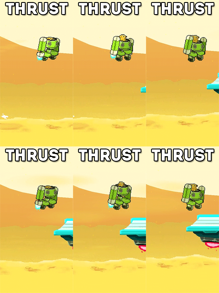
While game juice is largely about flair, it's also about improving clarity. In MechDog, there are three ways to move up vertically.

The regular jump emits a smoke plume that launches MechDog off the ground, the thrust ignites MechDog's thrusters (eventually emitting black smoke when nearing it's max use), and the enemy bounce causes a massive explosion that throws MechDog into the air. Associating unique flair to each action lets the player easily recognize that the game is responding to their different decisions.

Design

WHY IS GAME JUICE SO IMPORTANT?

Games requires a base level of feedback in order to be playable. Players read feedback to understand how their actions affected the game. When that feedback is strong and highly responsive, the game can feel alive. Game juice enhances the connection between the player and the game, which colors all other player-game interactions.

Are there wrong ways to do game juice?

Going back to my two guides for game juice. I find it massively important to ensure that clarity is never drowned out by style. It's sometimes a fine line to walk, but I think a good rule to follow is: the less actions there are available to the player, the more stylish the feedback can be. It's why MechDog is a good game to talk about game juice; as an mobile endless runner there is a smaller list of actions the player can do.