Bernard Hwang

Level Designer

MechDog

Post-Mortem: MechDog

Post-Mortem, Solo ProjectBernard HwangComment

MechDog is an endless runner created for mobile devices. In the game you control a dog in a mechanical suit who is racing across the desert. I collaborated on artwork with @stupaah, but everything design and scripting related was done by me. MechDog is also my first mobile release (I've only prototyped things in mobile before) so there were a lot of lessons and pitfalls during development.

3 Things that Went Right

  1. Keeping an Updated Dev Blog
    The dev blog for MechDog was first started to share development progress and demonstrate design knowledge on my portfolio. An unexpected benefit from running the dev blog was that it provided a chance to reflect on design decisions. I was able to take a perspective that wasn't a developer's perspective by trying to write for a non-developer audience. Many game creators warn of the fallacies in trying to provided useful feedback when you become so entrenched in development; the dev blog provided a good way to take a unattached look at my own game.
  2. Going for 3D Lighting
    The 3D lighting definitely adds something unique to the visual style of MechDog. I used the small scope of the game to my advantage and tried out this new visual looks that combines 2D assets with 3D tech. Although it took a lot more time and effort than I'd like to admit, the 3D lighting adds depth to the look of the game that I can't now imagine the game without.
  3. Middleware service Integration
    There was a bit of hesitation on implementing middleware. The hassle of having to work with live 3rd party services was new and intimidating. Looking back on it now, it was a silly trepidation to have. Using Google Play Services was an easy way to have multiplayer features and including Unity Ads enabled me to create an interesting feature for the in-game shop. Adding new middleware features were low-risk and high-reward. 

3 Things that Went Wrong

  1. Skipping Visual Concepting
    I foolishly made the choice to forego any visual concepting during pre-production. Between designing and developing, I left the art style of the game to come together during development. Unfortunately, the cobbled together art style is present in the game.There are many mismatching visual elements that hurt the game's presentation. Creating a visual concept for how I wanted the game to look at the start would have gone a long way to make the game's visuals feel cohesive. 
  2. Ignoring Technical Limitations
    MechDog was a project that definitely went past its set deadline. A large chunk of time was lost to reverting visuals effects to try and save performance. It was in the middle of development when I learned that perf tests on mobile are different than on PC. Feature additions/changes that are innocuous on PC performance can cause unexpected hits on mobile. Adding frequent perf tests to my schedule from the start of development would have probably saved me dev time in the long run.
  3. Underestimating Content Costs
    MechDog provided me the opportunity to really get into systems design (most notably the procedural level generator).Unfortunately, the time and effort I spent on systems design didn't factor in the associated content design. Game content is essentially fuel for a game system, and I made the mistake of only focusing on creating a good system. Procedural systems like the one in MechDog are great for stretching less content, but the game would have probably benefited from more enemy types and more upgrade options.

Outcome

Working on MechDog has taught me a few things.

  1. Design new content at the same time as designing a new system
  2. Keep an updated blog, it helps reflect on design decisions especially when working alone
  3. Perform platform stress tests even if you are familiar with the engine
  4. When working on mobile, plan for frequent performance tests rather than tabling them for the end 
  5. Don't be afraid to give middleware features like Google Play Leaderboards a shot

DevBlog - MechDog - Game Juice

DevBlog, Solo ProjectBernard HwangComment

This blog covers MechDog's approach to "Game Juice" and the process that was followed when "juicing up" the game.

Everything you see in this post is work in progress.

Defining Game Juice

"Game Juice" or "Game Feeling" can be defined as something that accentuates feedback in a game. A few examples of Game Juice would be a projectile exploding into sparks upon impact, a dust cloud being created on jumps, or a camera zooming in during consecutive gun fire.

Gun-Jam (2014)

Gun-Jam (2014)

That's a boiled down version of the definition. The term can be interpreted in more lofty ways such as something that enhances the feel of a game. The shared idea between the term's interpretations is that it's a way to improve a game by enhancing existing elements in a game rather than creating brand new ones.

Making Game Juice

When juicing up a game, I keep creativity at the core of the process; but there are also two guides I use to make sure the juice doesn't come out too sour.

Make sure it's stylish

Doing something impressive with seemingly little effort is stylish. All games create this relationship where the player inputs something into the game, and then the game displays feedback to the player. So in order to make an action stylish, let's make the feedback noticeably awesome even if the player's input is relatively small.

GameJuice-01.png

There's no major expense in this case for rewarding a lot for a little. Doing a small movement on the analog stick and pressing a button can be met with an "equivalent" feedback or a "juiced"  feedback.

"Equivalent"

"Equivalent"

"Juiced"

"Juiced"

MAKE SURE IT ADDS CLARITY

While game juice is largely about flair, it's also about improving clarity. In MechDog, there are three ways to move up vertically.

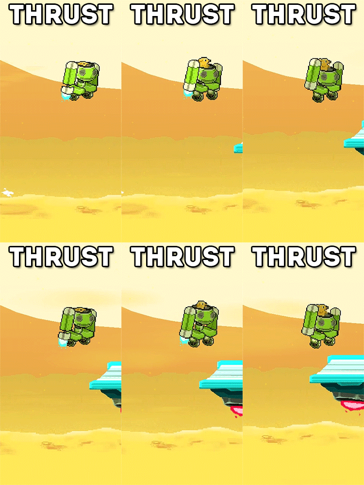
The regular jump emits a smoke plume that launches MechDog off the ground, the thrust ignites MechDog's thrusters (eventually emitting black smoke when nearing it's max use), and the enemy bounce causes a massive explosion that throws MechDog into the air. Associating unique flair to each action lets the player easily recognize that the game is responding to their different decisions.

Design

WHY IS GAME JUICE SO IMPORTANT?

Games requires a base level of feedback in order to be playable. Players read feedback to understand how their actions affected the game. When that feedback is strong and highly responsive, the game can feel alive. Game juice enhances the connection between the player and the game, which colors all other player-game interactions.

Are there wrong ways to do game juice?

Going back to my two guides for game juice. I find it massively important to ensure that clarity is never drowned out by style. It's sometimes a fine line to walk, but I think a good rule to follow is: the less actions there are available to the player, the more stylish the feedback can be. It's why MechDog is a good game to talk about game juice; as an mobile endless runner there is a smaller list of actions the player can do.

DevBlog - MechDog - The Role of Ads

DevBlog, Solo ProjectBernard HwangComment

This post covers one of the more controversial aspects of mobile games, the role of in-game ads. During development of MechDog, I had a crash course in in-game ad design. Faced with the decision of how to monetize MechDog, I was in a position where I realized the value of having ads, but at the same time was well aware of the stigma attached to ads.

Everything you see in this post is work in progress.

WHAT KIND OF ADS?

There are two popular formats for ads in mobile games.

Banner Ads
Placed on the game screen, these ads are always visible to the player when they are playing. A popular option for these ads lets players pay a fee to have them removed.

Interstitial Ads
These ads take up the entire screen for a certain amount of time. There are options to make these ads skippable or unskippable. Some games reward the player for choosing to watch these ads.

Shop Slot Spin

MechDog's ads are placed in the shop screen. Pressing the "Watch Ad" button:

  1. Shows the ad (interstitial, unskippable)

  2. Plays a slot roll animation that cycles between the 4 upgrade options

  3. Lands on a random upgrade which is awarded to the player

I attached an extrinsic reward to the ads to supply a positive with a negative. In terms of when this ad appears, they show up after a challenging dungeon section providing a lull in the game's intensity.

Design

What caused caution when implementing ads?

As mentioned at the top of the post, there is a danger when implementing ads in a game. Sticking an ad close to hotspots for touch controls can easily cause frustration, and following a game over screen with an ad can instantly turn a player off to a game. A poorly placed ad can be obtrusive, stagnating, and even punishing for the player.

What was the approach for MechDog's Ad Placement?

There were two rules I followed when placing ads in MechDog

  1. Have Purpose for the Placement
    Any ad shown in the game should have a greater purpose than merely being to make money. It's a simple rule, but it is easily broken when ad design is lazily approached.

  2. Don't Punctuate Negative Feedback
    By the nature of what they are, ads are a negative. They interrupt flow/concentration by showing unrelated content. Accompanying a negative action in-game with an ad puts focus on how intrusive the ad is.

Dev Blog - MechDog - The Shop

Solo Project, DevBlogBernard HwangComment

The shop system was iterated so that a few of the game systems were better aligned with the game's main aesthetic. 

Everything you see in this post is work in progress.

Previous Shop Implementation

Recap

The previous shop system created this loop:

In the previous version of MechDog, upgrades were only available on the main menu and not in game. All upgrades purchased were applied permanently to the player's character for all future runs.

Analysis

The upgrade system provided a set of long term goals; it gives players something to strive towards in-between runs. A con of the permanent upgrade system was that it made the leaderboard an unreliable tracker of player skill. Player scores were being augmented by the amount of upgrades in the player's possession. The player's focus was split during a run between, collecting currency for the next upgrade and getting a good score for the current run; two goals that are orthogonally opposed.

Reconstructing the Pattern

This shop pattern is created from the combination of these components:

  • Permanent Currency System
  • Permanent Upgrade System
  • Player abilities
  • Score System

The score system is the "end-game component", the component that is being supported by the rest of the components in this system. In the context of the shop pattern, the currency system supports the upgrade system, and the upgrade system which improves player abilities supports the score system.

Knowing the problem that we want to solve and how the related components work with each other helps us better aim our iterations.

Iterating on the Shop

  1. The initial iteration was to move the upgrade system into the game run. The shop menu would only appear after the player completed a dungeon, and any purchased upgrades would only affect the player during the current run. The currency used in the shop was still persistent between game runs, so the problem of mixed player goals still existed.
  2. The next iteration changed the currency system so that it would only persist in one game run as well. This removed the long-term goals in the game, but doesn't create conflicting goals between score and currency.

Result

The new shop loop is all self-contained in a single game run. On any run, players start out on an even playing field, giving no one a score advantage from the start. The end run score the player receives is achieved purely through player skill rather than a player's playtime. The new shop loop aligns the goals of getting a better score and getting upgrades since they both only take place in the same instance.

Design

Why prioritize score over upgrades?

I wanted the social aspect of MechDog to be more profound. That's why the game includes Google Play leaderboards. The initial playtest group I had for MechDog made the game into a competitive experience, and I didn't want to subtract from that experience with systems that undermined the score aspect of the game.

What does having a shop add to the game?

The shop adds an intermediate goal in the game. Completing a moment-to-moment segment tests the player's platforming skill. Going through multiple moment-to-moment segments tests the player's ability to collect coins for the upcoming shop screen.